by S. Sara Groß
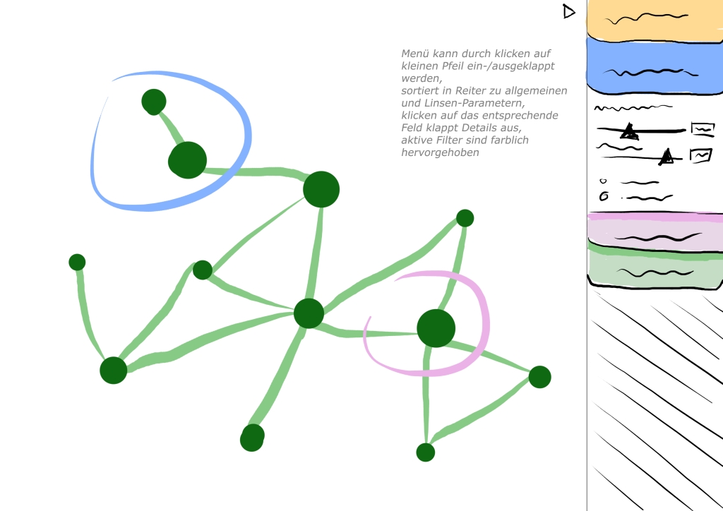
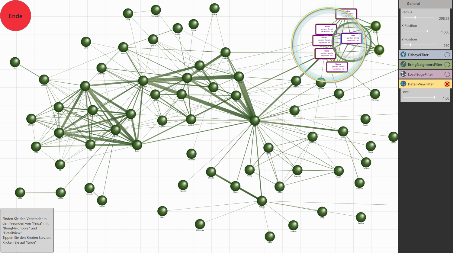
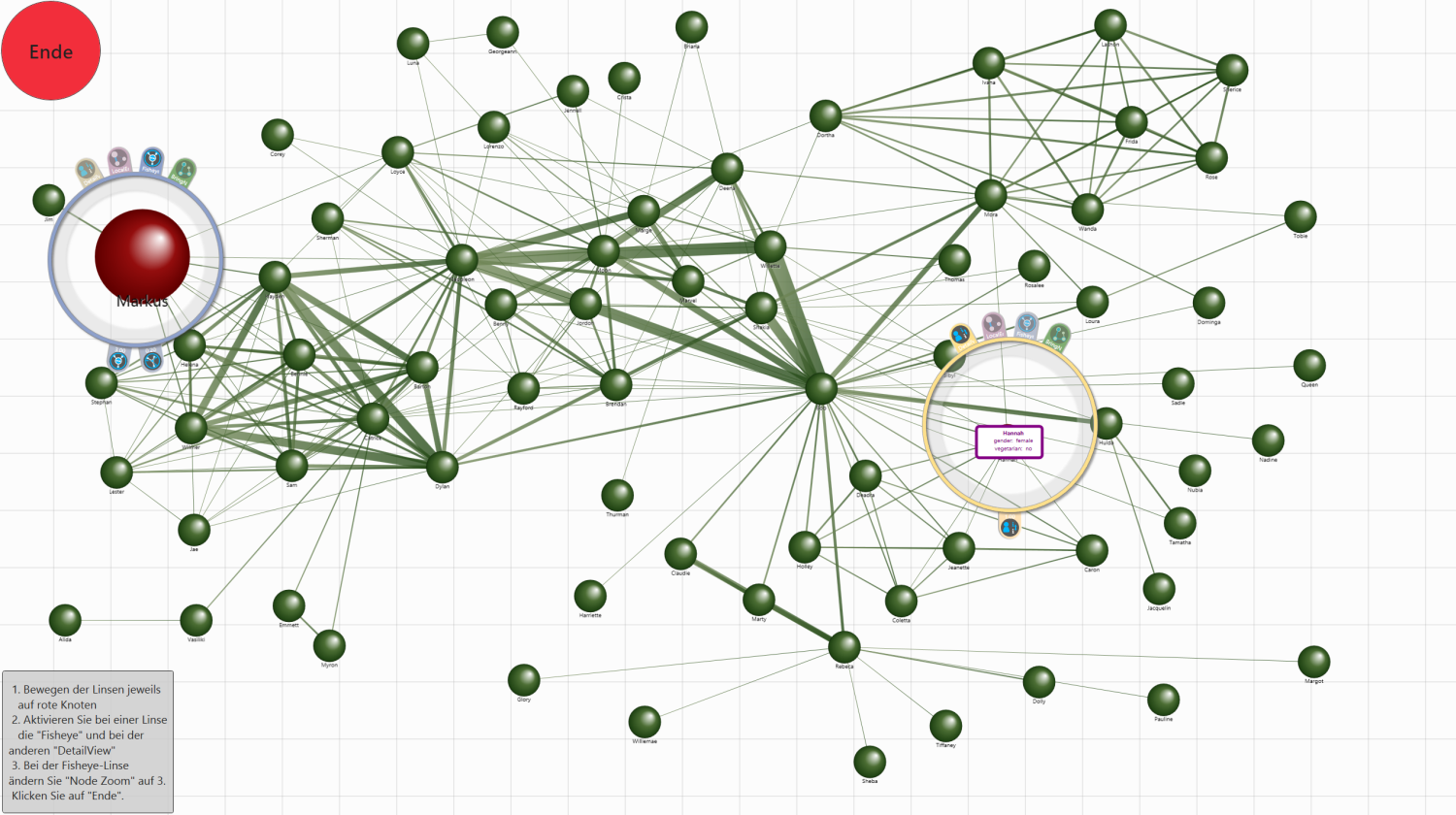
The complex analysis of huge data sets is an increasing challenge in information visualization. With the help of Magic Lenses the somtimes confusing visualization of those data sets is being locally manipulated and simplified. Especially the amount of filter functions and how they can be altered matter. The advantages of multitouch displays in comparison to conventional mouse and keyboard interaction are used. However, there occur continual problems with the adaption of existing menu designs. Since Magic Lenses have to be parameterized with those menus the question arises which kind of menu and interaction are more fitting. In this work we evaluate a multitouch based context menu for Magic Lenses. It is located directly at the lens and compact but new to users. We test its competitiveness to a classical global menu specifically designed and implemented for this study. Users are more familiar with it but it is distanced from the lens. Finally, the results are summarized and analyzed under quantitative and qualitative points. It turns out that classical menus with touch interaction performed best. The multitouch-based context menu though was more popular with probands and was preferred for the work with lenses.